What a great ecommerce homepage does in the first screen
Before anyone scrolls, a homepage has to say what the store sells, why it is worth trusting and where to go next. Patterns from the stores in our Showcase.
By The Ecom Awards editors

The first screen of a homepage is the most looked-at space a store has. It’s also where the most arguments happen: the new collection, the sale, the brand film and the newsletter all want to be there.
We looked at the stores in the Showcase for what their homepages get right. Not every store does all of these, and they shouldn’t. But the good ones make a few clear choices rather than trying to say everything at once.
1. Say what you sell, plainly
A visitor should know what the store sells within a few seconds. The most confident stores in the Showcase do it by showing the product, not describing the brand.
Hex Pens is a focused stationery brand. Its hero tells the story of one fountain pen, and the store sells the inks and nib units that go with it. There’s no doubt about what you’re there to buy.
2. Let the product fill the frame
Balmoral, a Canadian running apparel brand, uses full-screen editorial product imagery. It looks like a fashion brand but still shops cleanly on every page. Built with MILL3.
Casper’s Caviar sells three caviars and lets motion and imagery do the work. With a range that small, a big image isn’t decoration. It is the catalogue.
The point: a large image works when it shows the product people will buy, not a mood that could belong to anyone.
3. One moment of play, not ten
Some of the most memorable homepages in the Showcase use motion or 3D. The good ones pick one idea.
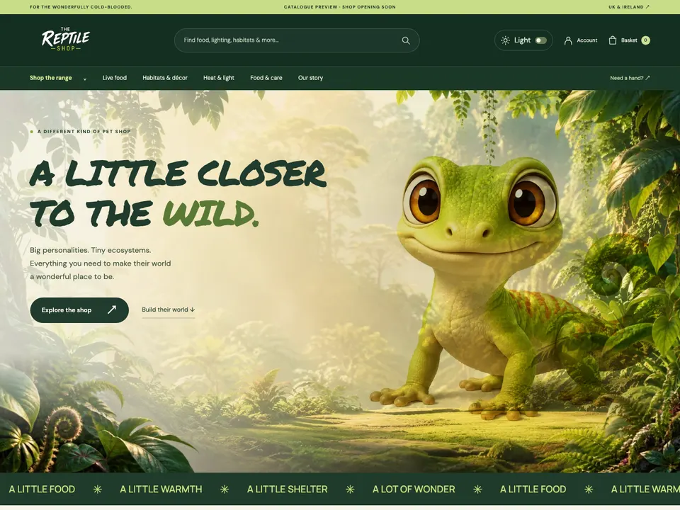
- The Reptile Shop opens with an interactive 3D gecko, and has light and dark modes. It feels like stepping into the jungle, and it’s still a shop for live food and vivariums.
- Aardvark Book Club uses a scroll-driven 3D book reveal, so joining the club feels like an unboxing on screen.
- Nymphai Cosmetics uses 3D product renders to present a small skincare range like a magazine.
In each case, the moving part is the product or the brand’s world. It isn’t an animation for its own sake.
Motion earns its place on a homepage when the thing moving is the product.
4. Point to the right first click
A homepage is a set of doors. The best ones are labelled the way customers think, not the way the warehouse is organised.
- The Reptile Shop lets you shop by species.
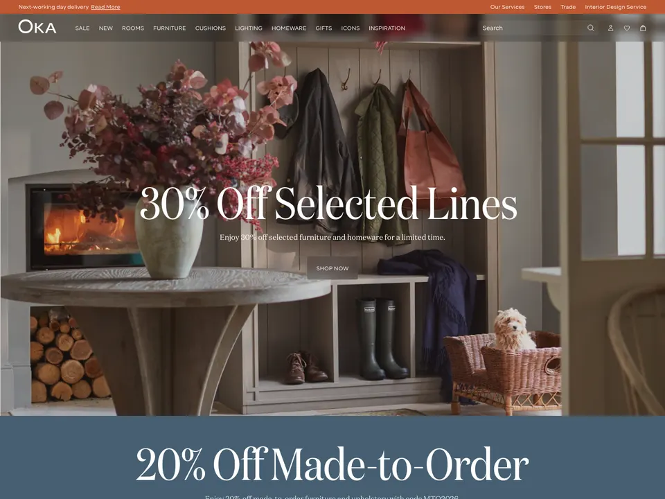
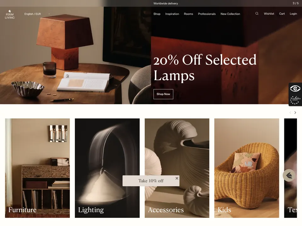
- OKA and Ferm Living sell furniture and interiors room by room.
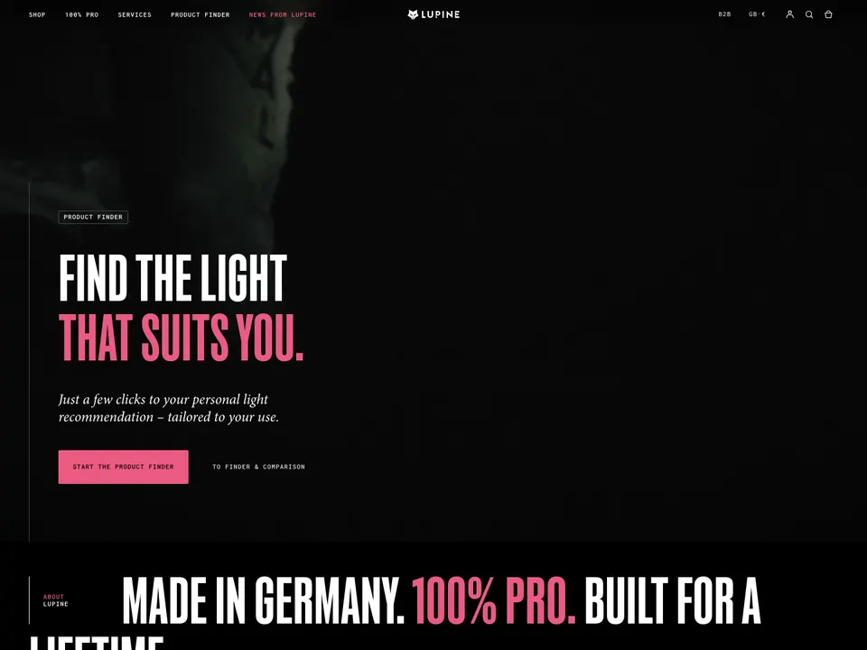
- Lupine Lights organises technical bike lights and headlamps by activity: mountain biking, commuting, running and winter.
- Absolute Collagen lets people shop by concern: skin, hair or menopause.
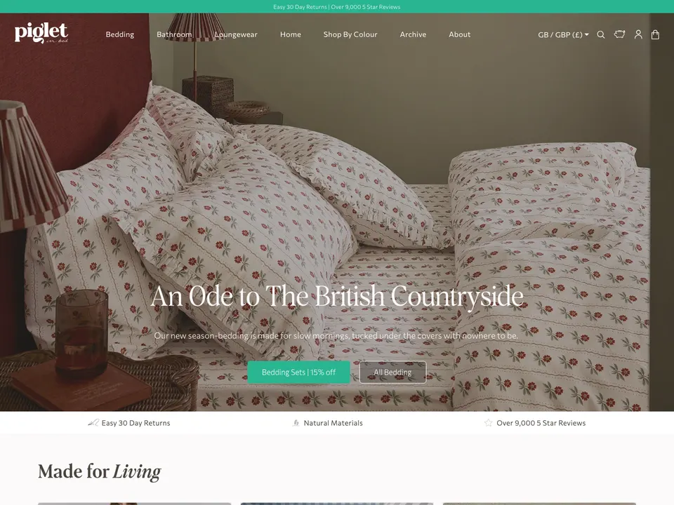
- Piglet in Bed lets people shop by colour.
Each of these matches the question a shopper arrives with. “What does my gecko need?” is easier to answer than “Which category is this in?”
5. Give a reason to trust you
New visitors don’t know you. The first screen, or close to it, should give them a reason to.
- Piglet in Bed shows its review count on the homepage.
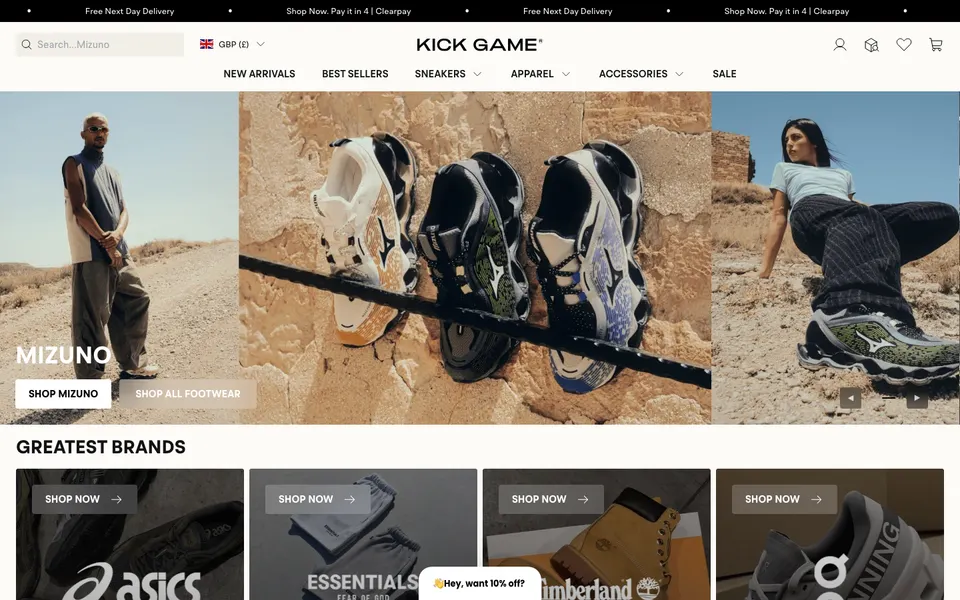
- Kick Game, a sneaker resale store, gives collectors the trust signals they look for: an authenticity guarantee, familiar payment options and a free next-day delivery option. Built with WIRO.
- Hex Pens states its tariff-free US shipping message plainly, which answers a worry before it’s raised.
The point: trust signals work best when they answer a specific doubt. For resale, it’s “is it real?” For a US buyer of a Canadian pen, it’s “will I pay extra at the door?”
6. Be right for where the visitor is
The Showcase is worldwide, and so are many of its stores’ customers. Chilly’s has a country selector covering more than 15 markets. Lupine Lights covers more than 40 regions. Balmoral has an English and French toggle. Getting currency and language right early saves a visitor from wondering whether they can buy at all.
What the first screen can leave out
Looking at these stores, it’s notable what they don’t cram in. None of them needs every collection, every offer and a pop-up competing for the same space. The stores that feel calmest have decided what the first screen is for, and let the rest of the page do the rest.
See more
The Motion, 3D and scroll collection groups the stores whose homepages move. For everything else, browse the full Showcase.
Spotted something wrong, or know a store we should look at? Email hello@theecomawards.com.